Reading Causal Inference in Python — Part 3: Effect Heterogeneity and Personalization
Evaluating models that provide unit-level recommendations.
AUTHOR
Nathan Horvath
PUBLISHED
2026-06-28
I'm reading Causal Inference in Python by Matheus Facure and writing about its key takeaways I find most useful for applied work. I'm aiming to solidify my existing understanding and help others avoid common pitfalls. You'll want to read my prior posts covering Part 1 and Part 2 before reading this one!
Most machine learning problems have an answer key. You make predictions and check them against reality. Causal inference doesn't work like that. Because we never see both potential outcomes for the same unit, there's no ground truth to check your Conditional Average Treatment Effect (CATE) model predictions against.
Standard machine learning metrics, like MSE or F1 score, reward models for accurately guessing the final outcome. They penalize a model for getting the grade wrong, even if it perfectly identifies which units need the intervention the most. A model with excellent predictive accuracy can be entirely useless for prioritizing who actually receives treatment. Judged by standard metrics, a perfect causal model will just look broken.
Data Setup
To figure out what good evaluation looks like, we first need a dataset where the ground truth is actually known. We'll use a simulated version of the tutoring problem we've been referencing that includes the true CATE. This is a luxury you never have in practice, but one we need here to clearly compare our evaluation tools.
In our simulation, a student's true sensitivity to tutoring (their CATE) depends heavily on their prior grades. Students hovering just below the threshold of 65 benefit the most, as structured help is exactly what they need to cross the finish line (gaining up to 16 points). Students far below the threshold have gaps too deep for tutoring alone, and high-achieving students already do well without it. Both of these groups see much smaller effects (gaining only 2 to 6 points).
Note: I'm omitting some of the data generating process here for brevity, but everything is here to see in this Solveit dialog.
Here is our data:
- struggling: Binary indicator for whether the student struggles academically
- prior_grade: The student's grade before treatment
- grade_level: 7th, 8th, or 9th grade
- tutoring: Binary indicator for whether the student received tutoring
- true_cate: The ground truth treatment effect for this specific student
- final_grade: The student's final recorded grade post-treatment
To show exactly where standard approaches fail, we'll generate predictions from three different models:
- A baseline random model that assigns a random uniform value between -10 and +10.
- A naive ML predictor (random forest) that directly predicts the final grade, which will demonstrate the trap of predicting outcomes instead of effects.
- A CATE model (T-learner) built specifically to estimate the treatment effect.
Let's generate these predictions and assemble our final data table.
from sklearn.ensemble import RandomForestRegressor
import numpy as np

X,y,T =['struggling', 'prior_grade', 'grade_level'], 'final_grade', 'tutoring'

rf = RandomForestRegressor(random_state=42).fit(df[X + [T]], df[y])
df['ml_pred'] = rf.predict(df[X + [T]])

m0 = RandomForestRegressor(random_state=42).fit(df.query(f"{T}==0")[X], df.query(f"{T}==0")[y])
m1 = RandomForestRegressor(random_state=42).fit(df.query(f"{T}==1")[X], df.query(f"{T}==1")[y])
df['t_learner_pred'] = m1.predict(df[X]) - m0.predict(df[X])

df['random_pred'] = np.random.default_rng(42).uniform(-10, 10, len(df))
| struggling | prior_grade | grade_level | tutoring | true_cate | final_grade | ml_pred | t_learner_pred | random_pred |
|---|---|---|---|---|---|---|---|---|
| 0 | 61.2 | 7 | 0 | 2.0 | 69.4 | 69.6 | 9.7 | 5.5 |
| 1 | 49.7 | 7 | 0 | 6.0 | 38.0 | 43.7 | 13.8 | -1.2 |
| 1 | 55.7 | 8 | 0 | 8.3 | 53.3 | 54.0 | 7.8 | 7.2 |
| 0 | 73.7 | 7 | 1 | 2.0 | 85.3 | 85.7 | 8.9 | 3.9 |
| 0 | 79.1 | 8 | 1 | 2.0 | 81.1 | 86.2 | -3.7 | -8.1 |
| ... | ... | ... | ... | ... | ... | ... | ... | ... |
Calibration vs Ordering
Model evaluation operates on two distinct dimensions: ordering and calibration. Ordering asks if the model correctly ranks units from most to least sensitive to the treatment. Calibration asks if the estimated magnitudes are actually correct.
The business problem dictates which one matters. If you are prioritizing a limited resource, like deciding which 100 students get a tutor, ordering is enough. If you are sizing an intervention, like calculating the exact ROI of that tutoring program, you need calibration too.
A calibrated CATE model is naturally well-ordered, but the reverse isn't true. An ordered CATE model might correctly rank student A above student B, while predicting A gains 50 points and B gains 40 points, when the reality is 5 and 4 points respectively.
Since we can't observe counterfactuals directly, no single metric captures both of these dimensions. Instead, we measure them separately. Here are three tools to do exactly that.
Tool 1: Effect-by-Quantile
First, let's focus on evaluating ordering. If you sort units by their predicted CATE and group them into quantiles, a well-ordered model will show actual treatment effects that monotonically increase from the lowest decile to the highest.
To check this, we estimate the realized effect within each group by running a single-variable regression of the outcome on the treatment. Since our data is randomized, the slope of that regression is our estimated effect for the bucket. We can use the fklearn library to do this, which runs this exact OLS calculation under the hood for each quantile segment.
from fklearn.causal.validation.curves import effect_by_segment

fig, axs = plt.subplots(1, 3, figsize=(12, 4), sharey=True)
for ax, m in zip(axs, ['random_pred', 'ml_pred', 't_learner_pred']):
    eff = effect_by_segment(df, 'tutoring', 'final_grade', m)
    ax.bar(range(len(eff)), eff.values)
    ax.set(title=m, xlabel='Quantile')
axs[0].set_ylabel('Estimated Effect')
plt.tight_layout()
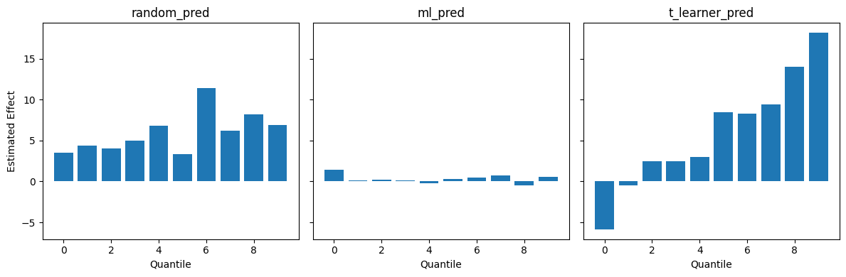
The random model bounces up and down unpredictably. The naive ML predictor, however, shows zero effect across the board.
When you sort students into buckets by their ML-predicted final grade, you are grouping together students who are expected to end up in the exact same place. But for a tutored student and an untutored student to land in the same bucket, the untutored student must have started with a higher baseline to perfectly offset the boost the tutored student received. Since everyone in the bucket ends up with roughly the same final grade regardless of their treatment status, the measured treatment effect inside that bucket is zero. The baseline difference entirely masks the intervention. As a result, using a standard predictive model to prioritize an intervention makes a highly effective intervention look like it does absolutely nothing.
By contrast, the CATE model (T-learner) forms a clear staircase. It ignores the baseline outcomes and successfully isolates the students whose grades are most sensitive to tutoring into the top quantiles.
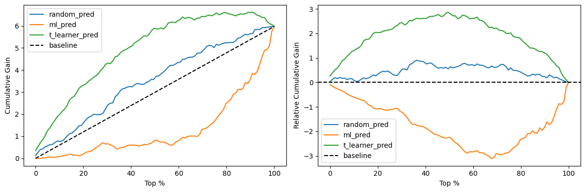
Tool 2: Cumulative Gain Curves
While the effect-by-quantile plot evaluates each bucket independently, a cumulative gain curve shows how much total value a model captures as you roll an intervention out.
Instead of looking at independent buckets, we sort the units by their predicted CATE in descending order. Then, for any given cutoff (say, the top 20%), we first calculate the ATE for that entire accumulated group, resulting in the cumulative effect. But treating 20% of the population with an ATE of 10 is very different from treating 80% with an ATE of 10. To reflect the total value captured, we multiply that cumulative effect by the fraction of the population it represents, giving us the cumulative gain curve.
A random ordering will track the diagonal baseline. If you treat a random 20% of your students, you expect to capture 20% of the total available treatment effect. A model that successfully ranks high-effect units first will bow upward, capturing a disproportionate share of the effect early on.
To make comparing these curves easier, we can normalize them by subtracting the ATE baseline. The resulting relative cumulative gain curve flattens the random baseline to zero, meaning any area above the line represents the pure value the model adds to the ordering problem.
But visual comparisons only get you so far. When you need to perform automated model selection, you need a single number to optimize: the area under the relative cumulative gain curve (AUC). We can generate both curves using fklearn:
from fklearn.causal.validation.curves import cumulative_gain_curve, relative_cumulative_gain_curve

def get_pct(df, min_r=30, steps=100): return np.array(list(range(min_r, len(df), len(df)//steps)) +[len(df)]) / len(df) * 100
x_pct = get_pct(df)

fig, axs = plt.subplots(1, 2, figsize=(12, 4))
for m in['random_pred', 'ml_pred', 't_learner_pred']:
    axs[0].plot(x_pct, cumulative_gain_curve(df, 'tutoring', 'final_grade', m), label=m)
    axs[1].plot(x_pct, relative_cumulative_gain_curve(df, 'tutoring', 'final_grade', m), label=m)
axs[0].plot([0, 100],[0, cumulative_gain_curve(df, 'tutoring', 'final_grade', 't_learner_pred')[-1]], 'k--', label='baseline')
axs[1].axhline(0, color='k', linestyle='--', label='baseline')
axs[0].set(xlabel='Top %', ylabel='Cumulative Gain'); axs[1].set(xlabel='Top %', ylabel='Relative Cumulative Gain')
for ax in axs: ax.legend()
plt.tight_layout()
def auc(df, t, y, m): return relative_cumulative_gain_curve(df, t, y, m).mean()
for m in ['random_pred', 'ml_pred', 't_learner_pred']: print(f"{m} AUC: {auc(df, 'tutoring', 'final_grade', m):.2f}")
random_pred AUC: 0.45
ml_pred AUC: -1.74
t_learner_pred AUC: 1.89
Note: I calculate the AUC manually here instead of using
fklearn's built-in AUC function. Thefklearnimplementation wraps the final result in an absolute value, which masks the fact that our ML model is actively reverse-ordering the treatment effect.
Notice how the T-learner forms a strong curve above the diagonal. The naive ML predictor, however, bows downward. This means it performs actively worse than random. By sorting students by their expected final grade, it prioritizes the high-achievers who barely benefit from tutoring, pushing the students who actually need the help to the back of the line.
Tool 3: Target Transformation
The effect-by-quantile plot and cumulative gain curve evaluate ordering, but they completely ignore calibration. If you are calculating the ROI of an intervention, you need those magnitudes to be grounded in reality.
To check calibration, we need a target that approximates the individual treatment effect. We can build one using the same logic as the Frisch-Waugh-Lovell theorem from Part 2. By regressing both our outcome and our treatment on our covariates, we extract the residuals: $\tilde{Y}$ and $\tilde{T}$. Dividing the outcome residual by the treatment residual (that is, $\tilde{Y} / \tilde{T}$) gives us $Y^\ast$, an unbiased but highly volatile estimate of the unit-level treatment effect.
The volatility comes from the denominator. When the treatment residual is close to zero, the resulting $Y^\ast$ explodes. To fix this, we calculate the Mean Squared Error (MSE) of our model's predictions against $Y^\ast$, but we weight each observation by $\tilde{T}^2$. This down-weights the noisy estimates and provides a stable metric for calibration. In fact, these exact weights are derived from the loss functions used to train Double Machine Learning models.
import statsmodels.formula.api as smf
from sklearn.metrics import mean_squared_error

# 1. Isolate the residuals for outcome and treatment
X_cols = "struggling + prior_grade + C(grade_level)"
y_res = smf.ols(f"final_grade ~ {X_cols}", data=df).fit().resid
t_res = smf.ols(f"tutoring ~ {X_cols}", data=df).fit().resid

# 2. Construct the Y* target and the stabilizing weights
y_star = y_res / t_res
weights = t_res**2

# 3. Calculate weighted MSE for each model
for m in ['random_pred', 'ml_pred', 't_learner_pred']:
    wmse = mean_squared_error(y_star, df[m], sample_weight=weights)
    print(f"{m} Weighted MSE: {wmse:.2f}")
random_pred Weighted MSE: 195.06
ml_pred Weighted MSE: 4603.56
t_learner_pred Weighted MSE: 75.63
Here, the T-learner proves it correctly orders students and predicts accurate effect magnitudes. The naive ML predictor's massive error score confirms that predicting raw outcomes is a poor proxy for predicting treatment effects.
Terms and Conditions Apply
A quick mechanical warning: every bar in the effect-by-quantile plot and every point on the cumulative gain curve is just a regression slope estimate from a small slice of data. If the true relationship between treatment and outcome is nonlinear, these linear estimates will be wrong unless you apply the right transformations.
The much larger threat is selection bias. These evaluation tools absolutely require unconfounded data. If your evaluation set contains confounding, the tools will confidently measure that bias instead of approximating the true treatment effect.
The practical dilemma is that CATE models are data-hungry, but real-world experiments are expensive. A pragmatic tradeoff is to train on massive historical observational data and save your precious randomized data entirely for the test set. If your DAG is correct, you can control for the right variables to learn the true CATE from the observational data. The RCT-derived test set then acts as an honest check: it reveals whether your debiasing actually worked, or if unmeasured confounders still exist.
But this strategy has a strict rule. If you look at the RCT test results, realize your DAG was wrong, and go back to adjust your covariates, you have just turned your test set into a validation set. With a small RCT, you get exactly one shot. You must lock in your causal assumptions before you ever look at the trial data. If you want to iterate on your DAG, you need a separate RCT-derived validation set to afford those extra attempts.